ROLE:
Associate Product Designer
CATEGORY:
Finance, Shopping, Entertainment
COMPANY:
AmEx
TIMEFRAME:
4 months
ABOUT
AmEx Experiences is a new brand title as part of the Benefits family, which allows eligible card members to view and purchase exclusive events from shows, concerts, to small engagements. This revamped site is a roadmap for future markets that AmEx supports.
TEAM & ROLES
Jake Brenchley
(
Director of Product Management
)
Robert Smith
(
Senior Product Manager
)
Jennifer
Onyeagbako
(Senior Product Designer)
Lois Tatis
(Senior Software Engineer)
Manasa Lagisetty
(Software Engineer)
Jael Seatte
(UX Writer)
Pragya Bhatt
(User Researcher)
1. discovery
I supported the Rewards Team and Jennifer by being part of the research discovery and visual design process for AmEx Experiences. This part of AmEx’s portfolio was doing really well for the US market and our Product Team was aiming for a phased global launch to push to AU and UK markets.
The problem we were trying to solve was to allow AmEx Reward Card Members to view the entertainment section of AmEx regardless of tier statues.
A) People Problem
AmEx Reward Card Members feel that they’re not getting most out of their card based on their annual fee.
B) How did we know it was a problem?
Users were not spending/redeeming points or purchases with their Rewards card in 2019, which caused a ripple affect for current partnerships that AmEx currently had.
C) How do we know if we’ve solved this problem?
When customers discover they can use their Rewards Cards on events within the AmEx portal without relying on 3rd party platforms.
2. DESIGN STRATEGY
I started the process with understanding the basis of how users would access the site from the Rewards Page and compared a few points from our user testing sessions with participants of the first design. From this, we discovered what we had to revise for our AU & UK launch.
Designs and Prototype by: Jennifer Onyeagbako
USER TESTING
WHAT DID WE LEARN FROM TESTING THE PROTOTYPE FROM THE FIRST CONCEPT?
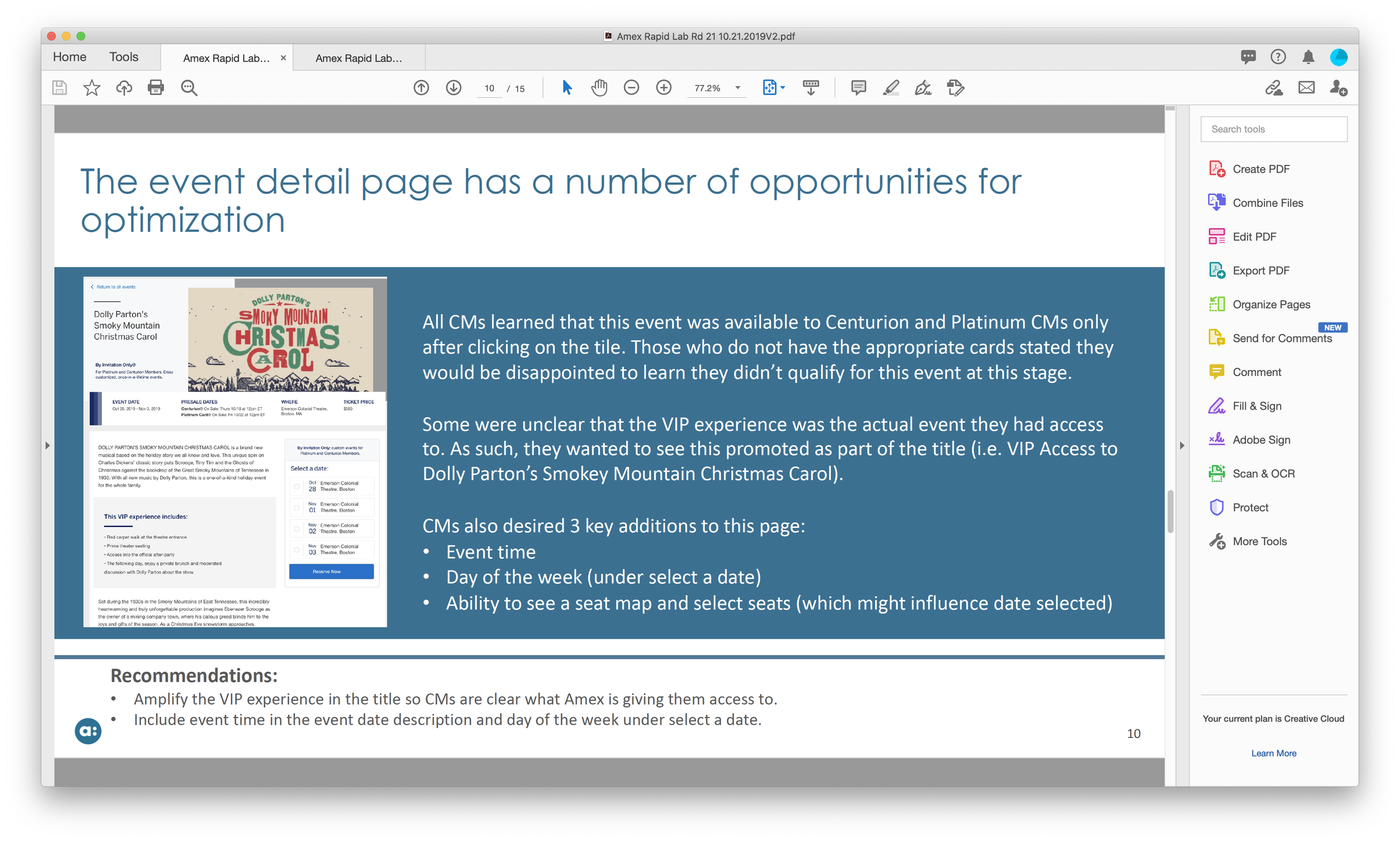
The team tested Jennifer’s first round of designs and we discovered that the flow was accessible, but the time it took to decide if the event was of interest to the participant lingered on. At a few points, participants were confused and overwhelmed with excessive text and content between the Homepage and the Event Details.
3. DESIGN EXECUTION
Iteration
WHAT DID WE LEARN FROM USER TESTING AND WHAT CAN WE ITERATE BASED ON THE FEEDBACK?
Image Hierarchy: Hero images are a critical piece of information that pushes the trajectory of the user journey when arriving on the page.
Aligning with Dates: AmEx members in AU read content differently in regards to dates, aligning with what they’re used to reading.
Education: Members need to know the differences of which events can be booked immediately or later.
Select a Date: Members shouldn’t feel overwhelmed with content while checking out.
References
WHAT ELEMENTS CAN I INCLUDE THAT COULD WORK IN THIS NEXT ITERATION?
I browsed other AmEx sites to combine what we had in Jennifer’s designs plus these references into one.
AmEx AU Campaign Site - Events
AmEx AU Campaign Site - Event Details
iteration + references
WHAT’S THE NEW SOLUTION?
I presented the corresponding designs for desktop, tablet, and mobile with specs documented to guide Lois and Manasa of how the designs would be created on their end. Design was altered due to requirements AU launch and user feedback to simplify the complexity of discovering events.
Landing Page:
Event and title name would captivate the user’s retention when arriving on this page and utilizing colors to contrast the distinction.
Customers immediately see the experience benefits to be educated on various types of events that are available.
Events itself have a distinctive feel when highlighting the image itself as the giveaway to dive deeper into the event details.
Event Details:
Customers are able to toggle through tabs on identifying the overview of the event plus check out.
Revision of purchasing tickets was to highlight the events and location and other logistical information to avoid cognitive load.
Final Design for Homepage - Web
Final Design for Event Details - Web
constraints
NOT ALL EVENTS WILL LOAD, HOW MIGHT WE INFORM OUR USERS THAT IS HAS/HAS NOT LOADED?
Lois and Manasa connected with me regarding API calls, certain events may not load. I suggested a solution where some aspects of animation to display the loading and error states could be a transparent experience.
Loading State for Hero Image
Loading State for Event Tiles
API Error for Single Events
Loading State for Content
API Error for All Events
4. OUTCOME AND TAKEAWAYS
THE ROADMAP TO FUTURE AMEX’S EXPERIENCES
My design was officially shipped, but scrapped due to COVID.
My biggest takeaway from this project was leading the end-to-end experience of developing the product and managing various expectations of different team members. I also was glad that our PMs were very active in our process from discovery all the way down to design creation to see from concept to usability testing to iteration.
The initial target was to have an increase in conversion by 10% with this redesign. However, this could be utilized for Q1 in 2021.


