
ROLE:
Founding Product Designer
CATEGORY:
Entertainment, Media, Job Tools
COMPANY:
Applebox
TIMEFRAME:
9 months


ABOUT
Applebox is an early stage company that aimed to provide a platform to connect quality freelance production crew to producers & projects across multiple genres & mediums.
TEAM & ROLES

Minji Chang (CEO)

James Youn (
CTO
)

Jonathan Saquicilli
(Marketing Director)
1. UNDERSTAND/PRODUCT THINKING
The team had 8 months of discovery work documented since April 2019 ranging from user interviews to technical development plans, but they didn’t have a clear vision of how the product would work from a user-centric perspective.
The problem we wanted to solve with this product was to bridge the gap between creatives on finding jobs in the film industry.
With the goal to launch an MVP platform in late 2020, I was able to understand the following:
A) People Problem
CURRENT - Film industry creatives are out of work due to the current COVID-19 pandemic.
HISTORICALLY - The industry has always been operating in a word-of-mouth mental model, which creates bias for other creatives that have the best qualifications for those jobs.
B) How did we know this was a problem?
CURRENT - Productions have been shut down to slow the spread of COVID-19. State governors initiating shut downs and restrictions in their state, resulting creatives to find employment elsewhere and/or filing for unemployment benefits.
HISTORICALLY - Majority of film creatives find jobs through friends of friends that happen to be male dominant, which has caused other creative to speak out against the discrimination and toxic culture in film sets.
C) How do we know if we’ve solved this problem?
When creatives feel they can trust signing up into this platform that provides jobs they seek and employers they can directly contact with. In this instance, sign-up rates for the MVP.
2. DESIGN STRATEGY
consolidating the data
REVIEWING THEIR DISCOVERY WORK TO REFINE A STRATEGY THROUGH DESIGN.
The team did an amazing job with uncovering the current competitors through their own extensive research, however, what was confusing for the team was their target focus in the film industry kept ranging from one specific group to another. I aggregated their Google doc conversations from their user interviews into specific personas that this platform for be devoted for.


ORIGINAL USER FLOW
WHAT WAS THE ORIGINAL INTENT?
I reviewed James’s first take at the user flow they wanted to achieve. There was a lot of features that the team wanted to have, but a lot of them were assumptions of what they thought users would like. From the original complex flow, I translated the vision into three simplified flows of what was achievable in the MVP, which were:
A user signing up for the first time
Job seeker’s journey
Posting a job.

Original Task Flow that incorporated a few examples (MFA login, Social Sign-In, Chat Feature, etc.)


After simplifying to these three flows, I consulted the team that we would translate these flows into wireframes and validate if our users are able to navigate our site plus analyzing their behaviors on the proposed features we discussed.
3. DESIGN EXECUTION
forming a strategy through design
WHAT WILL MAKE OUR PRODUCT STRATEGY DIFFERENT FROM OTHER COMPETITORS THROUGH DESIGN?
I referenced what I understood from our competitor market and noticed the following patterns:
Information Heavy: Site tells you what it services through words and some illustrations, but doesn’t show users how to go through the service.
Too Much About the Company: Hero header encompasses the whole site, giving very little value to users.
Dated: Some industry sites with big name union groups haven’t updated their sites since early 90s.

Production Hub Site - Heavy Hero Header
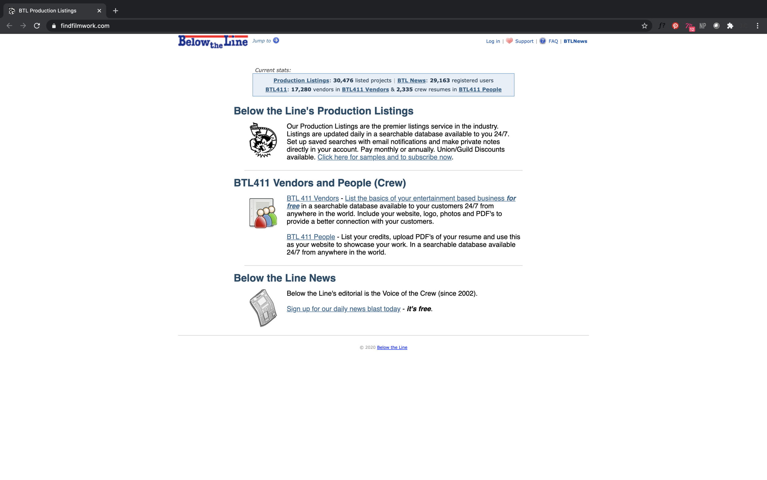
Find film work - Dated site still actively used by industry folks.
wireframing
DISPLAYING SOMETHING THAT ISN’T ABOUT US, BUT IT’S ABOUT BEING THERE FOR OUR CREATIVES.
I drafted a full wireframe journey and created a prototype according to the three flows we wanted to validate. From the competitive landscape and what the team wanted to do, we wanted to show content that showed this site is here for our job seekers. By doing that, I strategized to display jobs, profile, creating jobs, and viewing submission statuses as the forefront strategy.

Main Landing Page

Job Statuses

Creating Jobs
USER TESTING
WHAT DID WE LEARN?
We user tested my wireframes through participants who were affected by COVID-19 layoffs and seeking work. Our main takeaways throughout the journey was the following:
Pros
Job seekers felt empowered seeing jobs instead of a pretty site.
Ability to view job statuses gave validation to users.
Switching profiles for different roles was useful.
Cons
Discovering projects one is hiring can be simplified
Viewing candidates can be optimized.
Creating jobs for existing projects felt redundant.
Through this feedback, I went back to implement the visual designs to simplify flows for users who were hiring and went according to Jonathan’s brand guidelines for the direction of Applebox.
VISUAL DESIGN

Job Post

Viewing Job Statuses

Crew’s Profile

Creating Job

Viewing Applicants
4. OUTCOME AND TAKEAWAYS
THE ROADMAP TO APPLEBOX
My strategy and execution helped Applebox’s process in terms of design playing a key role in refining the product’s vision, discovery, and MVP launch through product thinking and user-centric design. The ultimate takeaway from this was despite the many competitors crafting the same service, the product strategy can always be altered and that’s what we did. Our MVP goal was to hit 500 sign-ups for our launch
What we have next is the launch of our MVP late 2020 and a few versions of our mobile web design that will be coming shortly in early 2021.


