
ROLE:
UX Consultant
CATEGORY:
Entertainment, Media, Streaming.
COMPANY:
Mammoth Advertising / Disney
TIME FRAME:
2 Months


ABOUT
Disney Studios has acquired multiple acquisitions since the last decade. From their many products, Mammoth Advertising was selected to create a For Your Consideration (FYC) campaign, which primary function is to allow guild members to screen up to 53 shows in consideration for the Emmys and other awards. Another function is to promote shows while highlight Disney Television Studio’s prestigious history.
TEAM & ROLES

Maria Quinn Shaw (Founder & Creative Director)

Charles Lam (Director of Technology & Production)
1. Discovery
With the launch of Disney + and FOX acquisition in 2019, Disney Studios wanted to hop into the For Your Consideration (FYC) campaign, I was contracted by Mammoth agency to create visual design explorations of how the Disney FYC streaming platform can be.
The problem we wanted to solve with this campaign was to allow our Guild Members to access content they can view without utilizing mail-in screeners.
A) People Problem
Entertainment Guild members can’t view FYC content because they are unable to receive screeners in time to submit a vote.
B) How do we know it’s a problem?
DVDs stopped being produce to prevent piracy.
C) How do we know if we’ve solved it?
When the site is live and Guild Members are able to submit their PIN code to stream their screeners.
2. DESIGN STRATEGY
RESEARCH other competitors
HOW DO OTHER FYC SITES DIFFER THEIR CONTENT FROM REGULAR STREAMING?
I identified a few different sites from several streaming services and compared what differed from their experience:
Netflix: Users have to specifically choose which site to enter due to specific tiers in the guild (producer, director, actor, etc.). After this, they’re able to view the content
Amazon Prime Video: Mammoth Advertising designed and deployed this site. Users are given full access to view the categories, libraries, and enter their guild code at any time. Top right gives users to stream on various devices as well as special events to explore. All in all, a one-stop access to everything.
Hulu: Users are welcomed with a sizzle reel on the site, they scroll down to view the categories and content. Guild log-in comes after a content is selected.
HOMEPAGE

Netflix FYC 2019

Hulu FYC 2019

Amazon Prime FYC 2019
SHOW DETAILS

Netflix Show Details Page 2019

c

Amazon Show Details Page 2019
DESIGNING ACCORDING TO THE SITE ARCHITECTURE
Charles and I discussed on the various designs from these different sites, which led to a common theme to include categories, tiles of the content, and a sizzle reel feature to gauge the users. From this roadmap, I went into identifying the anatomy of the Homepage and Show Details site through wireframes.
Technical limitations were not a challenge as Disney would be providing their own API and back-end to ensure the media files would load or appear on the homepage for this FYC period.

3. design execution
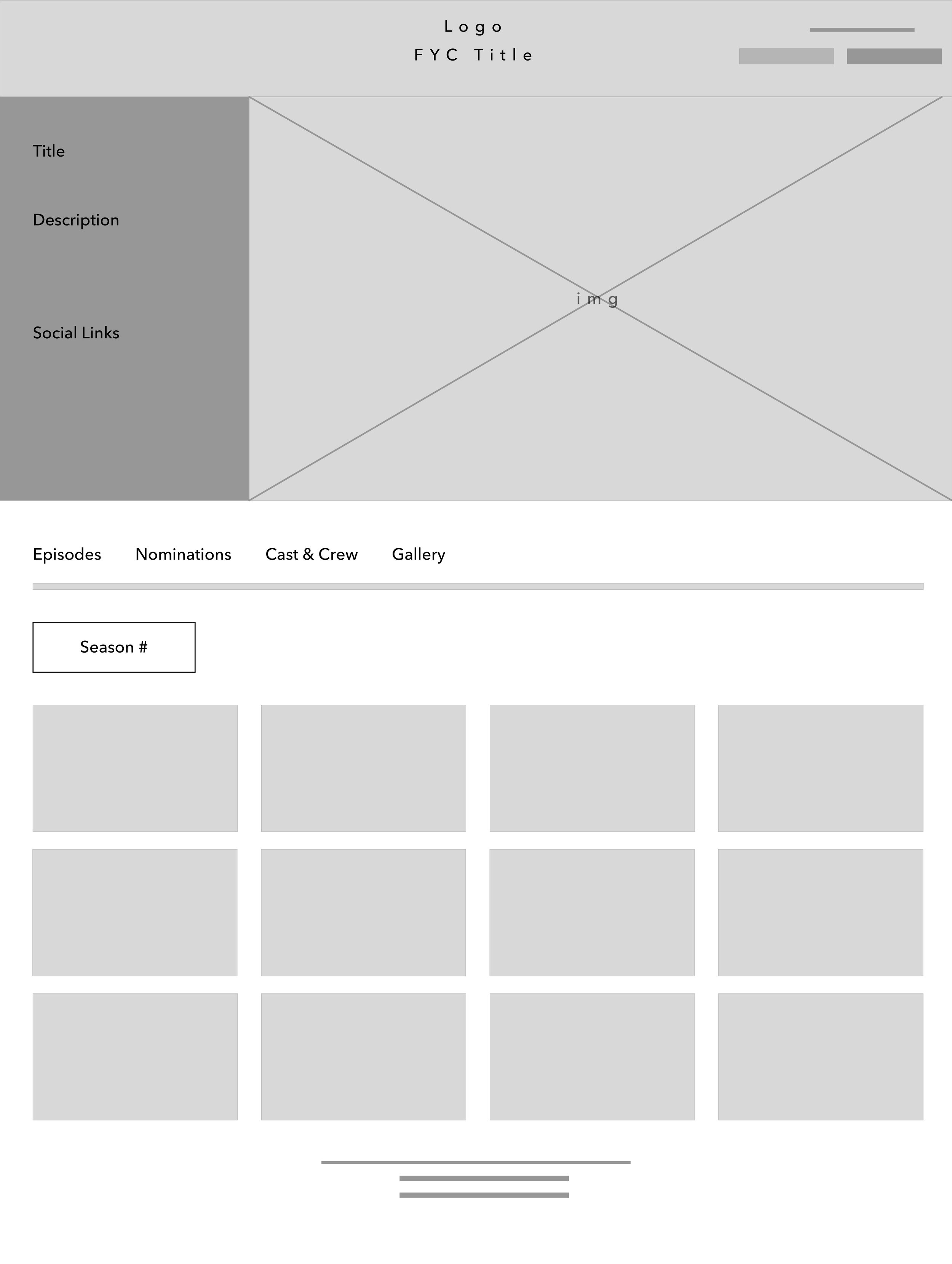
HOW DO I CONSIDER A LAYOUT THAT CAN ACCOMMODATE UP TO 50 SHOWS AND EPISODES?
To understand the full scope of the elements on the pages, I drafted wireframes for Homepage and Show Details to layout exactly where they could appear for desktop and mobile web in order to layout what can be implemented in the visual designs.


VISUAL DESIGN EXPLORATION
THE MULTIPLE OPTIONS FOR DISNEY TELEVISION STUDIOS
I applied the visual design process with different suits that would be accessible for the Homepage and Show Details. The constraints to account for in these explorations was the sizzle reel video that would play immediately at the user’s first visit and the how it would stop or continue when the user decides to scroll down to view the content.
HOMEPAGE
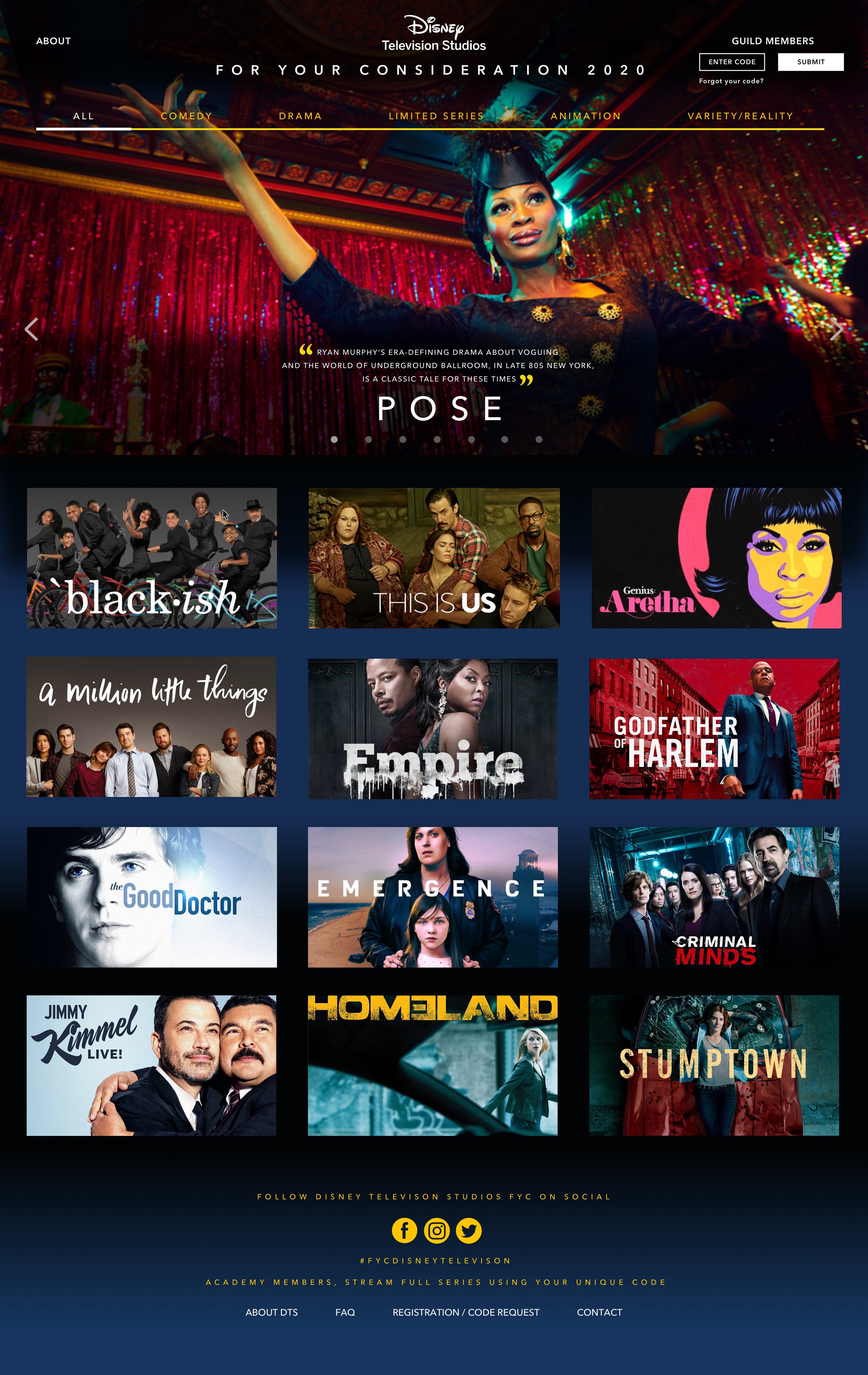
Option 1:
About and Guild Log-In are visible to the user for ease of access to enter their code to view content. Header hierarchy for this design was too stacked, taking too much real estate.

Option 2:
Same functionalities as Option 1, but placed next to each other. Certain tiles has more attention that others, which can affect OKRs for Award Season. Navigation has been revised to associate each category as its own. Guild code replaced with Login instead of entering automatically wasn’t a seamless experience.

Option 3:
Same functionality as Option 1, but About has been omitted as users would be able to understand the intention of the site when entering the URL information. This was the best solution to move forward with to build.
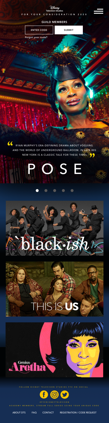
MOBILE VERSION
Same elements with Option 1

Same elements with Option 2

Same elements as Option 3, but categories are displayed overriding the navigation option.
SHOW DETAILS


feedback
HOW DID WE TEST IT?
I drafted a prototype test for the internal team to see how the functionality would work. We also received feedback from Disney on how the designs could easily match their integration when viewing the site in both platforms.
STYLE GUIDE
Assets and elements were chosen by Disney in order to follow suit the existing style that’s live on Disney+ today.

4. OUTCOMES AND TAKEAWAYS
I delivered the designs to Mammoth Agency as part of the agreement and it was also shipped to Disney for peer review and audit. However, Disney decided to scrap FYC altogether during 2020 to focus on Disney+’s launch.
What I learned from consulting on this project was balancing multiple stakeholders from various parties on advocating for user and business needs. I also was able to make impact on being agile and mobile on presenting how functionality can operate through prototyping the experience.